Here goes!
1. THE RED AND THE SCARLET, YA Historical Fantasy (think Sense and Sensibility meets Mulan and Jonathan Strange)


2. THE DARK AND THE SAPPHIRE (TRATS's sequel), YA Historical Fantasy


3. AMERICAN LEPRECHAUNS, YA Urban Fantasy (think modern day Narnia set in Central Pennsylvania with Ancient Ireland as Narnia and with gangster, motorcycle leprechauns)


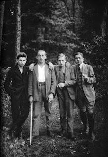
4. UNIVERSITY BESIEGED, YA Tragic Weird Western (think Chariots of Fire and Scorch Trials as one story, set in an alternate 1920s American Western Hogwarts that's basically the Alamo all over again)
Bonus for this one, because I made a poster.
5. BONNET AND THE WATERFRONT GIRLS, YA Urban Fantasy (think Raven Boys but with girls on the Charleston beach with flip flops and cupcakes and diversity and skateboarding and pirates and lost memories)
6. MARIUS DIMONT, Women's Historical Fiction (think Pirates of the Caribbean meets Cyrano de Bergerac set in Baroque Netherlands but with girls)
7. THE SOUL SAVER, Adult Steampunk Dystopian (I don't know if this is even a thing, but it is for me. And I have nothing to compare it to. However, I have too many photos for it.)
Well, there you go! I've been enjoying everyone else's tweets immensely, and hey, if you want to make a blogpost like this, let me know if you do... I want to see it!


No comments:
Post a Comment